An Icon for Scouting's Centennial
By John Clark
Photographs by John R. Fulton Jr.
Two Eagle Scouts put the finishing touches on a logo to commemorate the BSA's 100th anniversary.
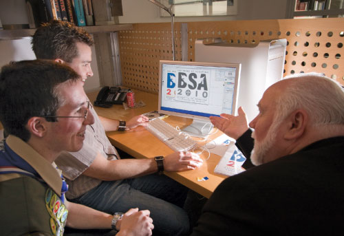 (From left) Graphic designer Scott Abel, logo-contest winner Philip Goolkasian, and Pentagram partner Kit Hinrichs team up to finalize a symbol for the future. |
Big business depends on corporate logos. They serve as vital visual symbols of a company’s brand, philosophy, and values.
That’s why organizations shell out megamillions to graphic designers who forge logos that create positive images for their products and services with the public.
The Boy Scouts of America took the road less traveled.
When it came time to design a logo celebrating the BSA’s 100th anniversary in 2010, the BSA sponsored a competition that solicited ideas from its youth members as to how this commemorative logo should look.
 “We could have hired a well-known, professional graphic design firm to create the logo,” said Robert Mersereau, project director for the 100th anniversary celebration, “but we thought that if our intention was to create a symbol to celebrate the youth of America, we should let youth create it.”
As a result, an 11-judge panel picked Philip Goolkasian’s design as the Grand Prize winner from more than 4,000 entries.
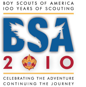
The 17-year-old Eagle Scout, a member of Sequoia Council’s Troop 223 in Fresno, Calif., designed a sophisticated logo that combined traditional American colors, symbols of Scouting, and outdoor imagery. (Find the winners of Cub Scout, Boy Scout, and Venturing categories at www.scouting.org/100years/.)
“Our 100th anniversary will be the perfect opportunity to remind everyone of all that Scouting has meant, and will mean, to the youth, families, and communities of America,” said Chief Scout Executive Robert Mazzuca. “Philip just displayed an extraordinary ability to capture the look and feel of what we wanted to portray, creating a symbol that will become a part of history.”
“It became obvious to the judges that Philip’s design was more than one-dimensional,” Mersereau added. “When they looked at all the entries, his just stood out.”
It stood out, at least in part, because of Philip’s eagle, created from so-called “negative space”—that is, a white shape carved from the letters of the “BSA” type.
Think FedEx.
As one of the world’s most recognized corporate icons, the familiar FedEx logo also uses white space (between the E and the x) to reveal a hidden-in-plain sight detail: an arrow. See it once, and you won’t miss it again.
Philip remembers thinking of the FedEx logo when sketching preliminary designs for his own. He also remembers the January day he learned he had won the contest. “I was working in the computer room,” he said, “and my little brother came running in yelling, ‘The BSA’s on the phone!’ I was jumping up and down, happy to know that my work was going to be on display.”
One of the first places Philip’s logo would be displayed was on the screen of a high-end Macintosh monitor at world-renowned Pentagram design studios in San Francisco.
Teamed with a legend
Work on finalizing Philip’s original logo began in February.
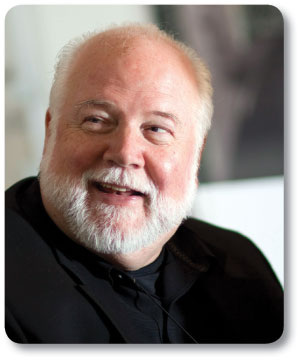 Design guru Kit Hinrichs, an Eagle Scout himself, was pleased with Philip's professionalism. |
Dressed in his Boy Scout uniform and sporting 34 merit badges on the sash draped around his shoulder, Philip’s attire contrasted with that of his sensei for the afternoon, one of the world’s foremost graphic designers, Kit Hinrichs, who wore black from head to toe.
You might not guess it from looking at Hinrichs, whose outfit and neatly trimmed white beard made him look like a cross between Darth Vader and Papa Hemingway, but he is an Eagle Scout, too -- as well as a Vigil Honor member of the Order of the Arrow. A long time ago in a galaxy far, far away. And the force is with him, like crazy.
Hinrichs studied at the Art Center College of Design in Pasadena, Calif., founded graphic-design firms in New York City and San Francisco, taught at several prestigious design schools, including the Academy of Art in San Francisco, and served as a partner in Pentagram since 1986.
He won the Oscar of the graphic design industry -- the AIGA Medal -- has seen his artistic efforts displayed in New York’s Museum of Modern Art, and amassed a 3,000-item collection of American flags and flag memorabilia.
Who could blame Philip Goolkasian, then, if he felt a bit uneasy.
Getting it right
Instead, the young Scout channeled his energy into that computer screen with a mixture of studied cool and wide-eyed uncertainty, like a proud parent sitting in on his child’s first dental exam. Where would Dr. Hinrichs start drilling?
For his part, Hinrichs had no intention of making the kid sweat. “I could tell he was protective of what he’d done,” Hinrichs said. “He didn’t want me or anyone else to mess up his work. And I didn’t want to put him in an overpowering situation.
“My job was to educate him in some of the things I’ve learned over the years -- to reinforce the strong points in his logo and make improvements so that it would reproduce most effectively in every way that the Boy Scouts intend to use it.”
Philip agreed. “He always asked me before he made a change. He had some really good artistic ideas, but he wanted to make it as close to the original as possible.”
Which is why Hinrichs began by suggesting a change of typeface from the one Philip had used to a “sans serif.”
Most likely, you’re not a designer or typographer or publisher. So a brief explanation.
Sans serif is a typographic term for unadorned characters in text. Look closely at the letters you’re reading now. See the flourishes at the ends, like tiny feet at the base of a capital “A” or the bulb at the top tip of a lowercase “c”? Those are serifs. Sans serif type, such as this, simply means without those serifs; the characters appear plain.
To make his point, Hinrichs held up a sample uniform patch that had been embroidered with Philip’s original logo. He showed Philip where the original typeface lost definition after being reduced to fit the patch.
“Why don’t we try something like Futura,” Hinrichs suggested, and quickly added, “if you’re O.K. with that.”
Philip’s shoulders relaxed noticeably. “Sure,” he answered, grinning. “I’m O.K. with whatever.”
Philip got the message. He began loosening up, asking questions and expressing his opinions -- taking part in a truly collaborative effort.
“I was a little bit astounded by his professionalism,” Hinrichs said later. “His ideas had been well thought out and presented in a very mature way. He’d given me 95 percent of what we were looking for. All I had to do was tweak a few details.”
No mean feat.
Graphic elements such as shapes, colors, type, and images can inspire recognition, brand loyalty, and trust for an organization -- or not. Success hinges on simplicity, how well, at a glance, the image conveys the essence of the organization -- McDonald’s golden arches, Nike’s swoosh, John Deere’s deer.
Or Philip Goolkasian’s eagle.
Birth of a winning logo
As early as third grade, Philip had demonstrated an affinity for the visual arts. Only one problem: He couldn’t make his hand drawings “perfect,” the way he envisioned them. That changed when he got his first computer.
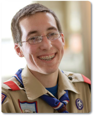 Philip relaxes, finally, after realizing his "eagle" is going to fly. |
“On the computer, I was able to take my ideas and manipulate them to look exactly like I wanted,” he said.
The son of two structural engineers, Maureen and Todd Goolkasian (his dad got Philip involved in Scouting and was his assistant Scoutmaster), he gravitated to left-brained applications, creating logos for events at San Joaquin Memorial High School and shirt patches during two trips to Philmont Scout Ranch in Cimarron, N.M. In the eighth grade, he designed one for the family’s business.
By August 2007, when he heard about the 100th anniversary logo contest, Philip figured he had a shot. “I’m pretty nitpicky about design. I felt that if I was going to participate in the contest, I might as well make the best logo I could.”
At a football game last fall, as he pencil-sketched designs in a notebook, Philip noticed that the beak of the majestic eagle he had drawn swooping in from the left side of the margin fit perfectly into the curve of the “S” in the typeface he had selected for the letters “BSA.” He left the game in the third quarter. He had a brainstorm and work to do.
The eagle has landed
The collaborators settled on a few other “purely production changes,” said Hinrichs. They added a second yellow color bar to emphasize the logo’s three distinct sections, altered the shade of those from what Hinrichs called “a taxicab yellow” to a gold that matched that of the BSA fleur-de-lis, and switched the zeros in the “2010” to “Os” to enhance their aesthetic appeal.
Hinrichs emphasized how difficult it is, even for pros, to work with a variety of traditional organizational symbols and integrate them into a single image representing the organization’s culture, while giving it a more modern look.
“The way Philip worked the eagle into the BSA type using negative space and gave every element a distinct hierarchy was quite sophisticated,” he said. “The kid has real talent!”
Philip plans to put that talent to use as an architect. He’s applied to several impressive schools to study that field -- Notre Dame and Catholic University, as well as schools closer to home: Cal Poly at San Luis Obispo and Cal Poly Pomona.
He remains committed to Scouting, as well. “It’s an incredibly rewarding activity. You can go camping, meet new people, learn to build a snow cave and sleep in it overnight. Mostly, though, it’s the whole impact of Scouting. It gives you leadership skills and confidence that you’ll need later in life.”
Like when you find yourself going one-on-one with the Michael Jordan of graphic design.
John Clark is senior editor of Scouting magazine.